Caps, Caps & More CAPS: MiLB
Hi,
I collect baseball caps. So for my first blog I thought why not list my top ten Minor League Baseball Caps I wish I could collect, but probably can't because either the team doesn't exist or was renamed, rebranded, etc. First up:
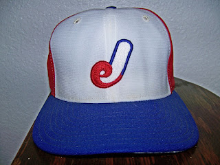
The Jacksonville Expos '87
Randy Johnson wore this cap when he played for them in 1987. A great take on the Montreal design, the modified Expos M becomes a J and sits upon White front panels with Red rear. The look is complimented with Blue brim and button. A completely classic look.
The Oklahoma City 89ers '83
Every Collection needs a good pillbox cap. This cap is retro on two levels, and a hell of a lot of fun. The Red OKC font is playful and when outlined in White completely stands out upon the Blue background of the cap. The white stripes and Red brim and button complete this great look. Maybe if the OKC Dodgers were thinking of rebranding back to something more local, 89ers is a much better name and this would be great for retro nights.
The Albuquerque Dukes '92
Greats like Pedro Martinez and Mike Piazza wore this cap. Next time I'm in ABQ I will have to pick one up if they have one. A Scarlett Red Cap with a cartoon Duke Albuquerque logo wearing his Conquistador Helmet with Zia and A. Hopefully one day the Isotopes will go back to being the Dukes. A cool name and great logo. The Alternate caps is a Red A inside a Red Zia on a Yellow cap or a reverse of all those colors. All three are great caps. But this is the classic. I do wonder if anyone considers this logo offensive? Especially the history of what the Conquistador's did to native peoples. Or is it like the Vikings or Fighting Irish?
The Syracuse Chiefs '84
Simple and completely 80's! A Navy Blue with stylized S. The alternate logo was a great design but I prefer not to buy Native American iconography. I confess I don't find the alternate logo offensive, but I know how the image of the Plains Indian Chief is overused and does not pertain to Native Peoples of upstate New York.
Trenton Thunder '94
For their inaugural season, making it incredibly rare, the Trenton Thunder sported a very 90's cap that looks tremendous in my opinion. A Green Cap with a Blue T for the city and Green Thunderbird spitting Yellow lightning. And it wouldn't be the 90's without the black alternate which is great too. I would love to have either of these in my collection. After this they went to a Thor theme which is a close second in my opinion to this look.
Vero Beach Dodgers '80-'06
Thankfully Dodgertown is still selling these so I may have to head down one spring to grab one. A Dodger Blue Cap with White Button and White VB sitting upon a Yellow lemon with Green leaves is unique and a great look.
Wichita Aeros '82
The odds of ever getting this cap are very slim. The Aeros wore this for one season, 1982. Another take on the Expos look of the 70's and 80's, A stylized W of Red White and Blue is centered upon a White front panel with Red rear and Blue brim. I am a huge fan of the Montreal Expos look, and this was a great tweak of the design to fit one of their farm teams, yet still not have to be called Expos.
Capital City Bombers '98
Columbia, SC, before the Fireflies, originally had a team called the Bombers, a name close to my heart since I went to Ithaca College. The cap was Black with Red brim and an aggressive WW2 stylized angry Bomber Plane flying through a Stenciled Black C with Red Outline. For the longest time in high school and college I wanted to get one. Alas, I may have missed my chance.
Queens Kings 2000
For one season, the Blue Jays had a short season team which played in Queens, NY. A Royal Purple Cap with Golden Q outlined in Emerald Green wearing a Crown studded with Emeralds. The next year the team moved to Brooklyn and became the Cyclones. They do on occasion rerelease this one, so odds are I will get one. Fingers crossed!
Fresno Grizzlies '04-'05
Somewhere in NYC this brilliant one of a kind hat left me. It was Forrest Green with an Arts and Crafts stylized Golden F upon an Orange background and of center and placed on the front left panel. Why they got rid of this design I will never know. It was so cool and unique. No bear icon, no baseball, just style. The alternate to this alternate was on a Olive colored cap. Not as cool as my original, but still cool.
There you have it. As of today, the 10 caps from the minors I wish I could have. Not every post on here will be about Baseball caps, but there will be more to come. If you did happen to read this, I'd love to know what you think. Comment below. :-) B


Comments
Post a Comment